Book layout

Beth has requested a fairly simple layout that works and doesn't distract away from the focus on her garments. I have gone with full bleed images as they have a good impact, especially with the bright colours of her garments, and for the bottles i have broken the rhythm of the book up with double page spreads and a simple staggered type layout for the garment descriptions.


here are some examples of the page layouts:


mock up book

Before i send the designs to print or start stitching i have mocked up the design of the book and have stitched it in preparation so that i know what to do. The mock up works fine and the pages hold firm with the technique i am stitching with and the thread that i have bought. i hope it goes just as well when it comes to constructing the real lookbook.


Front cover decision

After showing the front cover designs to Beth she has chosen the one which she would like me to lay up for the front cover of her lookbook and catalogue.


Beth has chosen this as her final front cover image:


I am happy that beth chose this image. it is simple and eye catching and still represent hat her collection is based upon.


Front cover designs

beth proposed an idea for her front cover that she had put together herself:


I took beths idea for her lookbook and then designed a few ideas which can be developed to become the front cover of the bottled bohemia.

Here are the ideas and design which i presented to Beth for her lookbook front cover design:


Bottle and Garment photoshoot

After the photoshoot with the bottles i shot the bottles with the garments inside as beth requested to have them like this for the lookbook as they are either sold together or individually. The lighting will be a little easier to shot as the garments brighten the shot up. It is going to be hard to match the standard of photography that Beths location photographer captured. I have booked the studio agin this evening.


here are the results of the photography shoot:


Bottle photoshoot

As beths collection is sold in intricate bottles she needed them photographing. Again i stepped up for this and took an evening to do a shoot so that the bottles can be featured in the lookbook.


I am really pleased with the way the photos for the bottles came out. i t was hard to photograph them without getting glare from the flash but with a little bit of help with the lighting some decent results were achieved. I will lighten them up in photoshop a little to create a more visual contrast before i add them to the lookbook.


Stock test


I was in talks with beth about what stock she wanted ti use for her lookbook. in my opinion i proposed she goes for a textures stock so it gives her book feel and depth and also a white stock that promotes her colour in her collection.


Just using this double page spread as a test before i send the lookbook to print was a good idea as it gave me an accurate idea of how the stock was going to handle full page ink coverage. as beths books uses alot of full page images this was valuable to know before hand. Surprisingly the stock took the could well and also added a good texture and feel to the entire book which was a real plus.


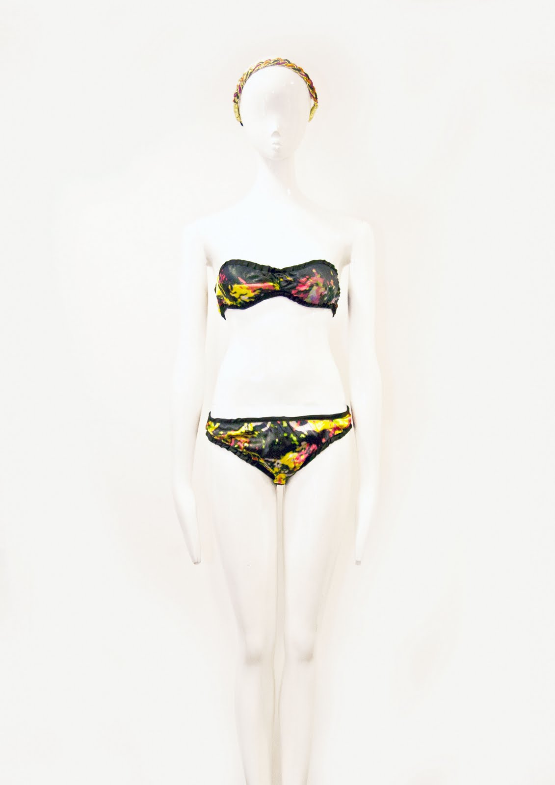
Photshoppped underwear images

After taking poor photos of the underwear garments i have photoshopped the images the best i could to be presented in the lookbook. I have shown Beth and she has said they are ok to go in the book. here are the images after they have been photoshopped:


I am quite happy with the results. I would of preferred to take decent images in the first place but i had to deal with what i got given and the deadlines i had to meet.


Underwear shots

Beth was running a little behind with her underwear set so agin didn't have time for the photographer to take shots of them during the location shoot so i stepped in to take a few shots for the lookbook myself. i had to take the shots quickly in her studio this evening. here are the results:


As you can see the images have come out with a strong yellow tint. i put this down to the poor lighting in her studio. i am really disappointed in these images as i had to do them in a rush and on screen they looked ok but when uploaded they look as poor as they do. I will photoshop them to make them look presentable for her lookbook and get them back to beth for analysis as soon as possible.


New location shoot

After receiving the location shots back beth relaised she had forgotten to take the pants to her orignal shot, this meaning that i would have to take some location shots of thm myself for the lookbook. This wasnt a problem as i have had phtography experience before, but trying to match her original photographers phtos would be a challenge. hopefully i will be able to achevie the same results that she is pleased with.


Below are the shots that i took for the location shot that i am going to use for the lookbook. The location was near to college on the leeds university campus as i believed the flower beds there would shoot nice weather depending.


I took the shots knowing that i needed to fill a double page spread and two single page spreads in the book, so i adjusted the angles and cropping of my photos to suit that. I am really pleased with the results and so is Beth. they came out better than i thought.